Qualitative data representation in Nvivo
The previous article reviewed data visualisation of case nodes through Demographic data representation in Nvivo and understanding its utility in qualitative method. This article explains qualitative data representation in NVivo. Visualisation takes place on attitudes or perceptions of participants on certain issues. With the use of different tools, visualisation takes place on different qualitative items of projects. Their connection and comparison with other items is derived, and collective map of all the items is created. The tools are as follows.

Explore diagrams for qualitative data representation
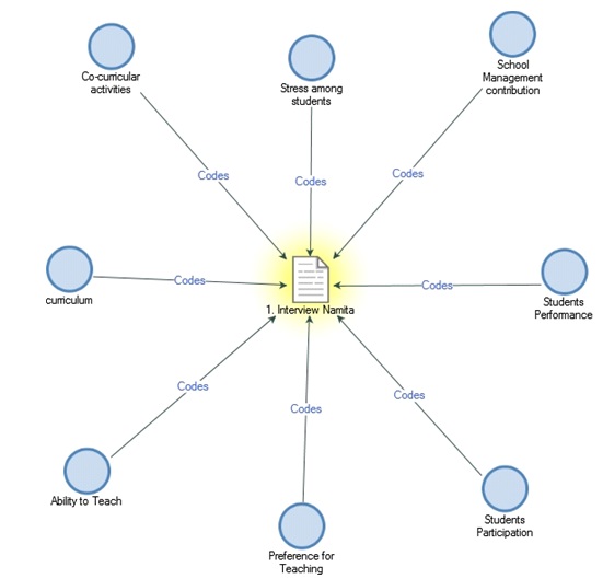
Explore diagrams help to focus on single items or related items of a project. An explore diagram consists of the central element of the study as the focus, with connecting elements around it. Explore diagrams are a dynamic tool. To generate it, select a source (interview), node or case (item to focus). For instance, in the case research, Namita’s interview is selected.
- Click on ‘Source’
- Go to ‘Interviews’
- Click on ‘Namita’
- Select ‘Explore’
The explore diagram will appear (figure below).
Select a connected item within the diagram to refocus on that item. The new image showing all its connected items will appear. In this way, focus can shift from one point to another in the study. For instance, shift focus to co-curricular activities by (figure below):
- Select ‘co-curricular activities’ (on diagram)
- Go to ‘Navigation’ (in ribbon)
- Change ‘Focus’.
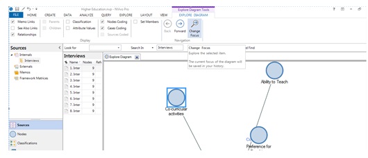
After refocus, the explore diagram for co-curricular activities will appear (figure below).

Also, the focus can be re-shifted to previously selected focus item (Namita’s interview in this case) by clicking on ‘Navigation’. The ‘Back’ key takes us towards the previously focused item (figure below).

To show more connections, other options on the main ribbon (figure below).

To create an explore diagram for case details with respect to the selected item, click on ‘Case Coding’ (figure below).

Since explore diagrams are not saved in project details, either export the diagram or paste it into memo.
Comparison diagram for qualitative data representation
The comparison diagram allows comparing two same types of project items. For example comparison of sources, nodes or cases shows the similarity and differences in the study. This diagram also helps in comparing coding of two different cases. To generate a comparison diagram, use below steps (figure below):
- Click on ‘Explore’
- Select ‘Comparison Diagram’
- Select ‘Compare Sources/Nodes/Cases’

In the case research, select ‘Compare Sources’ and select Namita’s and Reshma’s case for comparison. The following window will appear (figure below).

After clicking on ‘OK’, the comparison diagram will open in detail view (figure below). Here, the selected two case sources comparisons are visible. The common elements of the cases are present in center of the diagram. The uncommon elements are present in either sides of the diagram. Since there is no uncommon element in the case research, no item is present on either sides.

By double clicking on any item, view its content in detail form. Use the below options to hide or show the items of interest (figure below).

Project maps for qualitative data representation
Projects maps are the way of visually examining and presenting data. The first step is to construct questions of your study. For instance, what does your node structure look like? To construct a project map, follow below steps:
- Click on ‘Explore’
- Select ‘Project Map’
A dialogue box will appear like below.

Dialogue box firstly requires a name for the project map. Give the name on the basis of the objective of maps. For instance, for the question “What do nodes structures look like?”, name the project map as ‘Node Structure’. After giving it a name and clicking on ‘OK’, a project map will appear as a blank canvas. Select items in your project to add in your project map. For instance, in below given figure, click on ‘Add Projects Items’ (figure below).

After clicking on ‘Add Project Items’, a dialogue box will appear (figure below). It carries all the items that can be added in a project map. In this case, Namita’s interview is selected for project map.

Representation of interview
Namita’s interview appears in project map canvas (figure below). To see which all items are associated with Namita’s interview, click on the arrow sign marked in figure below.

A bar representing all the associated items of Namita’s interview will appear (figure below).

Add this associated item in the Project Map canvas to compete the map. For that, select the item to add and right click. The option for ‘Add item in Namita’s Map’ will appear (figure below).

Similarly, add all the associated items related with Namita’s interview (figure below).

After adding all the items, the project map will appear (figure below). This case includes only associated nodes and classifications.

The project map for all case classifications appears as under (figure below):

Cluster analysis of qualitative data using Nvivo
Data visualization helps establish relationship among attributes and attitudes in qualitative researches. Here the ability to teach (attitude) was connected with class assigned or extracurricular activities participated (attribute). It indicates the quality of education received by the students.
Tools like cluster analysis, mind maps and concept maps represent the researcher’s thoughts in a study. Cluster analysis helps in exploring the connection between any two or three elements. The connection is visualized in the form of clusters. It is similar to correlation analysis used in quantitative data. Mind maps and concepts maps are brainstorming tools to represent researcher’s ideas on connection between elements. These maps eliminate the chances of bias which occurs in case of manual interpretation of qualitative data. The next article explains cluster analysis of qualitative data.
I am a management graduate with specialisation in Marketing and Finance. I have over 12 years' experience in research and analysis. This includes fundamental and applied research in the domains of management and social sciences. I am well versed with academic research principles. Over the years i have developed a mastery in different types of data analysis on different applications like SPSS, Amos, and NVIVO. My expertise lies in inferring the findings and creating actionable strategies based on them.
Over the past decade I have also built a profile as a researcher on Project Guru's Knowledge Tank division. I have penned over 200 articles that have earned me 400+ citations so far. My Google Scholar profile can be accessed here.
I now consult university faculty through Faculty Development Programs (FDPs) on the latest developments in the field of research. I also guide individual researchers on how they can commercialise their inventions or research findings. Other developments im actively involved in at Project Guru include strengthening the "Publish" division as a bridge between industry and academia by bringing together experienced research persons, learners, and practitioners to collaboratively work on a common goal.
Discuss