How to create a graph in SPSS?
Statistical results are best presented graphically to make it easier for the reader to grasp the meaning of the numbers. In SPSS, graphical analysis is a separate function that allows generating graphs for data understanding. This article explains how to generate a graph in SPSS.
There are 8 types of graphs in SPSS
- Bar graph
- Scatter plot
- Line chart
- Histogram
- Box plot
- Pie chart
- Q-Q plot
- P-P plot
Each of these graphical methods helps in having information about nature, characteristics, and the issues in the dataset.
Making use of the bar graph in SPSS
Bar charts are a series of bars of different heights which allows to visually compare specific categories. A nominal or ordinal variable is placed on the horizontal x-axis such that each bar represents one category of that variable. Simply, a bar graph is used to have the majorly the count of different observations in the dataset. An example bar graph is as follows.

Follow these steps to get a bar graph in SPSS
Step1: Choose Graphs >> Chart Builder.
Step2: In the ‘Choose From’ at the bottom left, select ‘Bar’.
Step3: Select the type of graph image you want to use and drag it to the panel at the top of the window. With this, a window on the side having element properties will open on the top right.
Step4: In the Variables list, select the variables you want to use for the X and Y-axis. For example here Ethnic group is dragged to the X-Axis rectangle and the percentage to Y-axis. Click on OK.

How to generate a scatter plot in SPSS?
A scatter plot is simply an X-Y plot of disconnected dots appearing for each data point. It is used for presenting the entire dataset and identifying the presence of a relationship between variables, outliers, and linearity.

The above scatter plot shows the effect of starting salary on current salary. Each dot on the scatterplot represents both the starting salary and the current salary of an employee. It shows a normal line from the lower left to the upper right. Any dot on that imaginary line represents the salary of an employee who received a normal raise. The dots above the line are the employees who got above-average raises, and those below the line are those with below-average raises.
Follow these steps to get a scatter plot in SPSS
Step1: Go to Graphs >> Chart Builder.
Step 2: In the ‘Choose From’ list, select ‘Scatter/Dot’.
Step 3: Select the scatterplot diagram from the images and drag it to the panel at the top.
Step 4: From the Variables list, select the variables you want to use for building a scatter plot. Herein ‘Beginning Salary’ is dragged to a rectangle labelled X-Axis and ‘Current Salary’ to the rectangle labelled Y-Axis in the diagram. Then click on ‘OK’.
Order now
Present data series with a line graph in SPSS
A line graph is mostly used to show change over time as a series of data points connected by line segments on the coordinate plane. The line graph, therefore, helps to find the relationship between two data sets, with one data set always being dependent on the other set.

The graph above shows that the largest number of potatoes grew in the year 2011, as the maximum height of the graph is found to be of the year 2011 from the X-axis with a weight of 75 kg of potatoes from the Y-axis.
Follow these steps to get a line graph in SPSS
Step1: Choose Graphs >> Chart Builder.
Step 2: In the ‘Choose From’ list, select ‘Line’.
Step 3: Select the simplest line diagram and drag it to the panel at the top.
Step 4: In the Variables list, select the first variable and drag it to the rectangle labelled X-Axis in the diagram. Then select the second variable and drag it to the rectangle labelled Y-Axis in the diagram. Click on OK.
How to generate a histogram in SPSS?
A histogram represents the number of items that appear within a range of values. Histograms are useful for demonstrating patterns in data when you want to display information to others rather than discover data patterns. Below is an example histogram.

The Y-axis represents a frequency count, and on the X-axis, the value of the variable, in this case, is Height. This graph shows the frequency of people with respective heights.
Follow these steps to generate a histogram in SPSS
Step 1: Go to Graphs >> Legacy Dialogs >> Histogram, as below.
Step 2: Select the variable on the left-hand side that you want to plot as a histogram, then shift it into the Variable box on the right. Click on OK.
Use a boxplot to present categorical data in SPSS
A boxplot uses graphic elements to display five statistics at one time within each categorical value. The statistics are the minimum value, first quartile, median value, third quartile, and maximum value. Boxplot particularly helps to spot values lying well outside the range of normal values.

In the Boxplot shown above, each vertical column of graphics represents all the values of a category. Values beyond the extent of the first and third quartiles are marked with circles or stars. Those marked with stars represent extremes. It represents outliers.
Follow the below steps to generate a boxplot in SPSS.
Step1: Go to Graphs >> Chart Builder.
Step 2: In the ‘Choose From’ list, select Boxplot.
Step 3: Drag the first graph diagram (the one with the Simple Boxplot tooltip) to the panel at the top of the window.
Step 4: In the Variables list, select the first variable and drag it to the X-Axis rectangle select the second variable and drag it to the Y-Axis. Then click on ‘OK’.
How to generate a pie chart in SPSS?
The purpose of a pie chart is simply to show how something is divided into pieces of two or more. Each slice in the pie chart represents its percentage of the whole. Below is an example pie chart.

The graph shows the distribution of various educational levels with respective colours. The green colour is prominent in the visuals, indicating that maximum frequencies belonged to that category.
Follow the below steps to develop a pie chart in SPSS
Step1: Choose Graphs >> Chart Builder.
Step 2: In the ‘Choose From’list, select Pie/Polar.
Step 3: Drag the first graph diagram to the panel at the top of the window.
Step 4: In the Variables list, drag Educational Level to the ‘Slice By’ rectangle at the bottom of the panel. Click on OK.
How to generate a quantile-quantile (Q-Q) plot in SPSS?
A Q-Q plot, short for the “quantile-quantile” plot, is often used to assess whether or not a variable is normally distributed.

In a Q-Q plot like the one shown above, if the residuals fall along a roughly straight line at a 45-degree angle, then the residuals are roughly normally distributed. Since in the above Q-Q plot the residuals are deviating from the 45-degree line, especially on the tail ends, the data is not normally distributed.
Follow the below steps to generate a Q-Q plot in SPSS
Step 1: Import or create the dataset in SPSS.
Step 2: Click on Explore >> Analyse >> Descriptive Statistics >> Explore.
Step 3: Create the Q-Q plot. Drag the variable points into the box labelled Dependent List. Then click the button labelled ‘Plots’ and make sure the box is checked next to ‘Normality plots with tests’. Then click ‘Continue’ and ‘OK’.

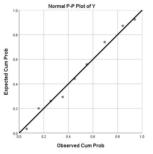
How to generate a P-P plot in SPSS?
The P-P plot compares data distribution with several theoretical models, using the empirical cumulative distribution function and cumulative distribution functions of normal, Laplace, and uniform distributions (Sankaran & Jayakumar, 2016).

If the data is normally distributed, the dotted plots follow the solid trend line as closely as possible. In the above P-P plot, since the data points are dispersed, the data is not normally distributed.
Follow these steps to generate a P-P plot
Step1: Click on Analyze >> Descriptive Statistics >> P-P plots
Step 2: Through the utilization of the centre arrow, designate “Y” as a variable. Then click OK.
References
- Sankaran, K. K., & Jayakumar, K. (2016). A New Extended Uniform Distribution. International Journal of Statistical Distributions and Applications ·, 2(3), 35–41. https://doi.org/10.11648/j.ijsd.20160203.12
I am a management graduate with specialisation in Marketing and Finance. I have over 12 years' experience in research and analysis. This includes fundamental and applied research in the domains of management and social sciences. I am well versed with academic research principles. Over the years i have developed a mastery in different types of data analysis on different applications like SPSS, Amos, and NVIVO. My expertise lies in inferring the findings and creating actionable strategies based on them.
Over the past decade I have also built a profile as a researcher on Project Guru's Knowledge Tank division. I have penned over 200 articles that have earned me 400+ citations so far. My Google Scholar profile can be accessed here.
I now consult university faculty through Faculty Development Programs (FDPs) on the latest developments in the field of research. I also guide individual researchers on how they can commercialise their inventions or research findings. Other developments im actively involved in at Project Guru include strengthening the "Publish" division as a bridge between industry and academia by bringing together experienced research persons, learners, and practitioners to collaboratively work on a common goal.
I am pursuing my msc in statistics from Kurukshetra University, kurukshetra and training myself in more statistical tools like sql, python,c programming, r programming, tableau, power bi, excel, matlab etc.
Discuss